Download the data
- Go to NHGIS.org and create an account. Once they have emailed you and you have confirmed your identity, then log into the site. It will take you to the Data Finder page.
- In the “Apply Filters” column, click on “Years”. In the table that opens up, select “1800” in the “Decennial” column, then “Submit” at the bottom. Then, click the ‘plus’ sign next to the first item in the Select Data table of data. This should be “NT1. Total Population” and it should be in the “source tables” tab, which is the first of 3 tabs.
- This one source table will then appear in the “Data Cart” in the upper right hand corner of your screen.
- Now click to the 3rd tab in the Select Data table, labelled “GIS boundaries”. It will list the GIS boundary files for states and counties for 1800. Choose the first county [not state] file by clicking the “plus” sign. It should now appear in your data cart.
- Click the green “Continue” button on the Data Cart. The website will prompt you to choose the geographic level you want for the 1800 source table. Choose ‘county’ and then click “Continue” again.
- The website will now provide you with a download page, called “Extracts history” By clicking on “tables” and “gis” you can download the two sets of files.
Perform a Table-Join: Merging a shape file (.shp) with comma separated data(.csv)
Note: Material under this heading is taken directly from the Wells tutorial, editing is noted with bracketed ellipses and comments
- Open QGIS. Start a new project. [JG: set the CRS to NAD83]
- Create a new shapefile layer. This is the basic foundation of the map. Open the zipped 1800 shapefile you downloaded from NHGIS. You should see a map of all 427 counties from the 1800 U.S. census. Use the mouse to zoom in and out. Grab and drag the map around. Play around with the buttons on the top toolbar.
- Now it’s time to upload the census data. Create a new “delimited text file” layer. This, of course, is census database.
- [JG: Use “Add a Layer” and choose “Add delimited text layer”] Add the census CSV file you downloaded from NHGIS.
- Be sure the “file format” is set to “CSV (comma separated values)”
- For “Geometry definition” select “No geometry (attribute only table)”
- Click OK.
- […] You should see the new layer in your “Layers Panel” on the right. Now we have to put the numbers into the map.
- Right click the shapefile. Click “Properties”
- Click “Joins”
- Click the green “+” symbol to join the two layers together.
- Set “Join layer” to the .csv file
- Set “Join field” to “GISJOIN” (thank you NHGIS for making this easy!)
- Set “Target field” to “GISJOIN”
- Press OK. This should put you back in the shapefile “Properties” dialogue box.
- Click “Fields.” Scroll down. You should see all the [population] data for every [county] census [in 1800]. Smile – that’s pretty amazing!
- Now it’s time to display some info on our map. In the “Properties” dialogue box of the shapefile. Click “Style.”
- Now it’s time to display some info on our map. In the “Properties” dialogue box of the shapefile. Click “Style.”
- Change the dropdown box on the top from “Single Symbol” to “Graduated”
- Change “Column” to the 1800 data (my file reads: nhgis0001_ts_nominal_county_AOOAA1800) [your file may have a different column name, like “nhgis0002_ds2_1800_county_AAS001”]
- Click the “Classify” button. You should see the box in the middle of the dialogue box populate with symbols, values, and legend entries.
- Press “Apply” then “OK.” You’re looking at a population map. It probably doesn’t look too awe inspiring at the moment.
- Go back to the “Style” dialogue box (right click shapefile, “Properties,” “Style.”
- Play around. You can’t hurt much (and if you do, it’s easy enough to start over). I suggest starting with the “color ramp,” “precision,” “mode,” and “classes” buttons. Remember: every time you make a change you have to press “apply” to see how it changes your map. [JG: “Natural Breaks (Jenks)”]
- Population is great but I want population density. Here’s how we get there
Create a new column based on data in the newly merged file
Note: This explanation is from Garrigus
- Right click shapefile, “Properties,” “Fields”
- Click on the abacus button, which is the “Field Calculator” which puts you into the “Expressions” dialog box. You are now going to build an equation to show population density.
- Under “output field name” type “Pop_densit”.
- For “output field type” chose “Decimal number (real)”
- Change the “precision” value to 4
- In the middle box, click on the “Fields and values” plus sign to expand it.
- Double-click the name of the column that shows the population of each county. It might be “nhgis0002_ds2_1800_county_AAS001”. That puts it into your equation.
- Click on the slash mark/division sign to put that into your equation.
- Click twice on the left-parenthesis button to put (( in the equation.
- Expand the “Geometry” field in the central box. Double-click “$area”, which is a function that will calculate the area of each county in square meters.
- Add the divide sign
- Type in 1000000 [1 million, or 1 followed by 6 zeros]. This converts square meters into square kilometers.
- Add a single right parentheses — )
- Add the multiplication symbol — the asterisk
- Type “0.386102”; this will convert square kilometers into square miles
- Put in a final right parentheses. The “expression ” box will now read something like nhgis0001/_ts/_nominal/_county/_A00AA1800/(($area/1000000)*0.386102)
- Click OK
- Now you are back in the “Properties” screen. Click on “Style” and change the top button to “Graduated.” Now select the column. You should find the new column “pop_densit” at the very bottom of the dropdown list.
Note: back to Wells’s text
- Click “classify.” The symbols, values, and legend figures in the dialogue box should have changes. Change the mode to “mode” to “Natural Breaks (Jenks),” pick a “color ramp” that makes sense, click “Apply” and “OK.”
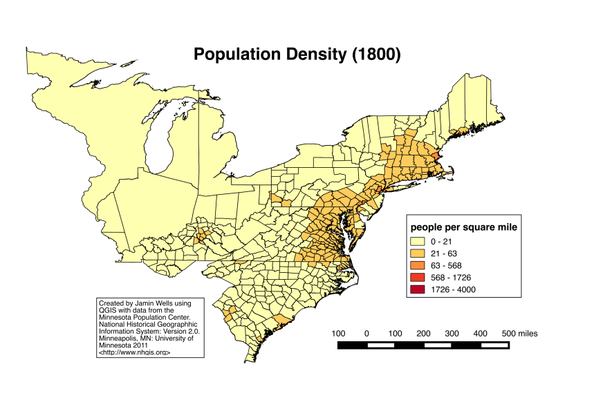
- There you have it: county-level population density in 1800. QGIS is amazingly versatile and adaptable and time spent “playing” with the representations is time well spent because only by going through the process of analyzing the data in different ways do you start to see new connections and patterns, which, of course, is one of the beauties of using GIS.
Note: Quoted Wells material ends here
What you have made is a “choropleth” map. If you zoom in on locations you suspect will be more densely populated, you should see darker colors generated by the 1800 data.
Formatting Your Own Data: Two Options
The data that you create yourself won’t be as nicely formatted as that from the NHGIS unless you do that formatting yourself. Specifically you need to tell QGIS which of the columns are text (or “strings”) and which are numbers (or “integers”) There are two ways to do this.
Unfortunately neither one works well with Microsoft Excel. Excel CAN save files to the CSV [comma-separated-value] format. But it does this in a way that is confusing to QGIS.
Instead use the open source Libre Office. It has “Calc,” an Excel equivalent. You can open your data [even if it was created in Excel] in Calc. Then you can do one of two things.
EITHER
Save your spreadsheet data in the DBF format and import that into QGIS as a regular vector file [not as a text-delimited file]. See https://www.mapbox.com/tilemill/docs/guides/joining-data/ for a tutorial
OR
Save the spreadsheet data in the CSV format.
– Then use a plain text editor to make a file with the same name, but ending in .csvt. That file needs to have a single line with the words “STRING”,”STRING”,”STRING”,”STRING”,”STRING”,”INTEGER”, [including the quotation marks and commas] where each of the words stands for each of the columns in your file.
– QGIS will use this csvt file to identify the kind of data you are importing. If you don’t do this, QGIS thinks every column is text [or “string”] and you won’t be able to do mathematical operations like calculate population density.
– Import that csv file as a text-delimited file. QGIS will find the cvst file because they have the same name and are in the same directory.
– For a tutorial on this method, see http://www.qgistutorials.com/en/docs/performing_table_joins.html
Leave a Reply